
Nurturing a Fragile Workforce
How might we create a safe and secure environment for mental health in the workplace?

Project Brief
Client
Pickup Studios
Role
UX/UI Lead
Industry
Healthcare
Project Description
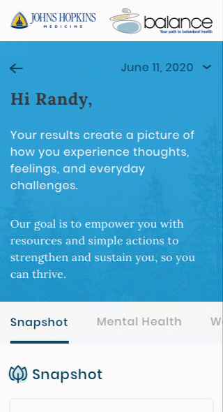
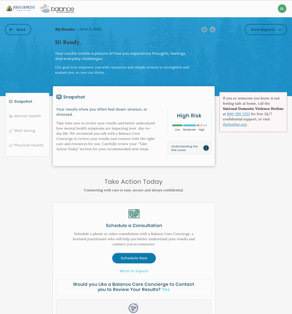
Emvitals is a user-centric mental health health dashboard which utilizes user input to baseline, monitor, and ultimately provide the tools needed to not only recognize and treat mental abnormalities, but also help remove the social stigmas surrounding mental health care.

Why Are We Here?
emVitals, a healthcare startup, aims to challenge mental health stigma in the workplace. They plan to partner with HR teams to conduct digital questionnaires for employees, monitoring their well-being and providing necessary support to improve mental health.
Step 1: Assess the Situation
emVitals already has a functioning product designed and built by developers to meet business requirements. However, their end-to-end process could have been more straightforward and intuitive. Multiple drop-off points and low conversion rates plagued it.
Step 2: Identify Problem Areas
Before joining the project, user feedback was not addressed. It was vital to align business requirements with end-user needs and prioritize research for success. When dealing with mental health, consulting the experts is crucial!as addressed, making research a key factor moving forward. Most importantly, when dealing with mental health - Ask the Experts!

My Responsibility
By forming an alliance with CEOs and Project Managers, I could show the benefits of research and design. Our first task was to conduct research interviews with the client and a few of their (brave and badass) employees.
One of my primary responsibilities was to bridge the information gaps between the company and its users. One significant insight (unsurprisingly) was that employees generally prefer not to discuss their mental health with their employers.


Actions
One of our most significant research findings was that users could only take the assessment on a company-controlled device. Even though they were comfortable with their work device, there needed to be more trust that employers couldn't use this information against the employees in future performance reviews or promotions. However, the client initiated these safeguards to protect the employees from potential hacking and HIPAA regulations.
Compromise
By considering employee feedback, the employer allowed the assessment to be conducted on any personal device after an initial security firewall. This provided the employees with the flexibility to take the evaluation wherever and whenever they wanted.
What Makes This
Service Unique?
Companies generally care about the well-being of their employees and traditionally offer an array of services to assist should the need arise. Plus, it should come as no surprise that a happy employee is generally more productive and that happiness is contagious to those around them.

Mental health isn't just about being
happy or sad
In fact, many factors are in play, whether longing or temporary. As a designer how do I recognize this and allow the user to not feel as though they are "damaged goods"?
Three Design Tactics
Use of Color
Color evokes emotion, and when we're dealing with mental health, our color palette requires light, soothing primary and secondary colors. There are no red errors or yellow alerts!
Messaging
The copy needed to complement the designs. The product's voice was critical to the success of this service.
Encouragement
Reminding the user that this is hard work and that they're doing the right thing! Reiterating that this is a journey, the user has already taken the most essential step.


Storyboard & Prototype
Our project was significantly influenced by user feedback from the existing product.
This feedback highlighted issues with locating primary calls-to-action and understanding the dashboard, which in turn guided our decisions on establishing a consistent page taxonomy and content hierarchy.


Early Design Explorations
Our initial design direction, which resembled a traditional dashboard with access to treatment options, connections to professionals, and an overall summary of the questionnaire data, was well-received.
Initial customer feedback indicated that the design direction was favorable, but it was noted that it still 'looked like a dashboard', a direction the client was not inclined to explore.


Iteriate
Armed with a mountain of customer and user feedback, we went back to the drawing board and presented a solution that received overwhelming support and enthusiasm.
Making Real Improvements
As we refined the design vision, we wanted to create something soothing, intuitive, and easy to follow. When dealing with mental health and design, keeping the end-user focused was crucial.


Project Takeaway & Results
Through research, collaboration, and perseverance, this product was launched during the Covid19 Pandemic when our first responder's mental health was at a breaking point. By aligning on a user-centric approach to product development, we not only built a valuable tool for mental health but also allowed the user to participate at a safe and convenient time.
Retention Rate
Conversion Rate
